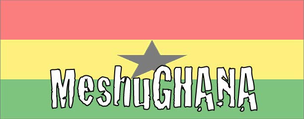
Hello to all my lovely 31 (million) blog readers. My darling and amazing friend Jennifer Mason (also referred to as Jenny Schechter) has taken it upon herself to design two new fancy title headings for my blog!! As Jenn and I can rarely make decisions about anything, we were left unsure of which heading design to use for my blog.
As a fan of the democratic process, I thought I would ask my readers to indicate which of the two options they prefer, and I will move ahead with what the majority selects. Or, I will charge you taxes and use this capital to set up a "Blog Heading Design Task Force" who will then deliberate over the decision for months to come. I'll be sure to report about this in my annual budget.
Unfortunately I cannot post these as large images or else I will be sitting by the computer watching a little spinning upload animation for about six more years. However, keep in mind that the introductory text is the same as the text that I currently have above.
Okay. So here is option number one:

And option numero dos (that's Spanish for "the second option I'm going to show you" or possibly "I'll have a number two please"):

Now in this second one, the squiggly line in the back is the introductory text following a "journey."
Post a comment with your preferred option!

Sit tight Gabrielle. Number 2 is prettier but unless the copy is clearly readable you have to go with number one.
ReplyDeleteThe new design is wonderful and I have to say that right?
There is no point voting for mayor -- all the candidates stink.
The first seventeen times i looked at the logos (kiiiiiiidddddding) I wasn’t too keen on Logo two and the winding journey text, now i quite like it.
ReplyDeleteHowever there are three things that make me lean more towards logo one.
1) the text is easier to read than the journey text.
2) I really like the star in the 'H' of Ghana.
3) I also like the added detail of the rising sun like shape in the courner of logo 1.
If you move the star and added the sun to logo 2 it would likely strike me more....but the text of logo 2, though much more clever in design, for some reason just puts me off. Maybe it’s because i am a little simple and for me the ‘journey’ text involves a lot of neck tilting and in one case, a rather poor excuse for a headstand.
I say as they are....I prefer logo 1 :)
Hope this helps.
P'Dawg x
Numero dos - But only if the floating star is added to the H. Or added as the hole in the middle A as the star usually falls in the centre of the flag. Hmmmmm? Just a thought. Both are pretty good Jenny - I like the style!
ReplyDeleteI am also on the side of #2, although Paula makes a great case for #1
ReplyDeleteI would go for "numero dos" as well. The squiggly line is very dynamic! I have to say, you're a great designer Jenny. Take care
ReplyDeleteI really enjoy the star being off center (in the H).
ReplyDeletePaula I think you've made it clear that you like the star in H....
ReplyDeleteOkay folks, Jenny and I have convened and we will go ahead with number two but with the suggested changes (including the aforementioned H Star).
# 1 !
ReplyDeletei meant, #2 !
ReplyDeletethe squiggly line one.
yeah.
i agree with everything. stunning work, Jenn!
ReplyDelete(suzanne)